Market Structure Event TrendThis indicator identifies and visualizes advanced market structure
concepts (SMC) alongside classic price action analysis. It combines
robust, non-repainting pivot detection with a sophisticated engine
that tracks dual-layer trend states, structural breaks (BOS/CHoCH),
and supply/demand zones (Order Blocks).
Key Features:
1. **Non-Repainting Pivot Detection:**
- Uses a standard lookback method (`left` and `right` bars) to
identify historical pivot points.
- **Note on Confirmation:** Pivots are only confirmed *after*
the `Pivot Right Bars` input has passed. This is essential
for ensuring the signal is non-repainting, but it
introduces an inherent lag.
- Automatically classifies the sequence of pivots according to
Dow Theory: Higher Highs (HH), Higher Lows (HL), Lower Highs (LH),
and Lower Lows (LL).
- **Flexible Pivot Algorithms:** Supports various underlying
mathematical models for pivot detection provided by the
core library
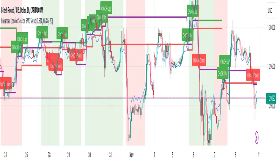
2. **Smart Money Concepts (SMC) Engine:**
- **Dual-Layer Structure:** The engine distinguishes between significant
**Major Structure** (Swing Points) and internal **Minor Structure**
(Sub-Structure). This allows traders to separate the overarching trend
from immediate order flow.
- **Event Detection:** Automatically identifies and visualizes key events:
- **BOS (Break of Structure):** Signals trend continuation when a
validated High/Low is broken in the direction of the trend.
- **CHoCH (Change of Character):** Signals a potential trend reversal
when a significant structural level is breached against the trend.
- **Pivot Classification:** Applies classic labels (HH, HL, LH, LL)
while also detecting Equal Highs (EH) and Equal Lows (EL) based on
a user-defined price tolerance.
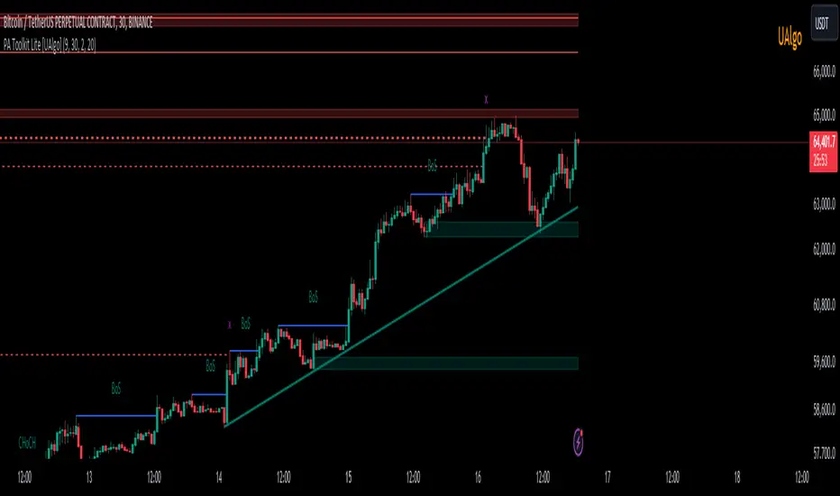
3. **Automated Order Blocks:**
- Identifies potential Supply and Demand zones (Order Blocks) formed
at the precise origin of a structural break.
- **Mitigation Tracking:** The indicator monitors price action in real-time
and automatically removes or updates Order Blocks once they have been
mitigated (tested/broken) by the price.
- **Scope Awareness:** Distinguishes between Major Order Blocks (Swing origin)
and Minor Order Blocks (Internal flow origin).
4. **Trend State Visualization & Dynamic S/R:**
- A robust state machine analyzes the sequence of events to determine
the current market trend (Bullish, Bearish, or Neutral) for both
Major and Minor scopes.
- **Dynamic Step-Lines:** Visualizes the trend structure directly on the
chart, creating a "staircase" effect that highlights trailing stop levels.
- **Extended Pivot Lines:** Extends dynamic horizontal lines from confirmed
pivots that act as Support/Resistance and automatically terminate
upon a structural break.
5. **Full Customization & Alerts:**
- **Display Options:** Granular control over the visibility of Events,
Labels, Symbols, and Lines. Supports "Relative" vs "Absolute" price
change display.
- **Visual Styling:** Extensive color customization for Bullish/Bearish
scenarios and Major/Minor hierarchy.
- **Comprehensive Alerts:** Set up precise alerts for:
- New Pivot formations (e.g., "Pivot Higher High").
- Structural Events (e.g., "Major Bullish BOS detected").
- Trend State Changes (e.g., "Major Trend changed to Bullish",
"Minor Trend no longer Bearish").
---
**DISCLAIMER**
1. **For Informational/Educational Use Only:** This indicator is
provided for informational and educational purposes only. It does
not constitute financial, investment, or trading advice, nor is
it a recommendation to buy or sell any asset.
2. **Use at Your Own Risk:** All trading decisions you make based on
the information or signals generated by this indicator are made
solely at your own risk.
3. **No Guarantee of Performance:** Past performance is not an
indicator of future results. The author makes no guarantee
regarding the accuracy of the signals or future profitability.
4. **No Liability:** The author shall not be held liable for any
financial losses or damages incurred directly or indirectly from
the use of this indicator.
5. **Signals Are Not Recommendations:** The alerts and visual signals
(e.g., crossovers) generated by this tool are not direct
recommendations to buy or sell. They are technical observations
for your own analysis and consideration.
Pine Script®指标